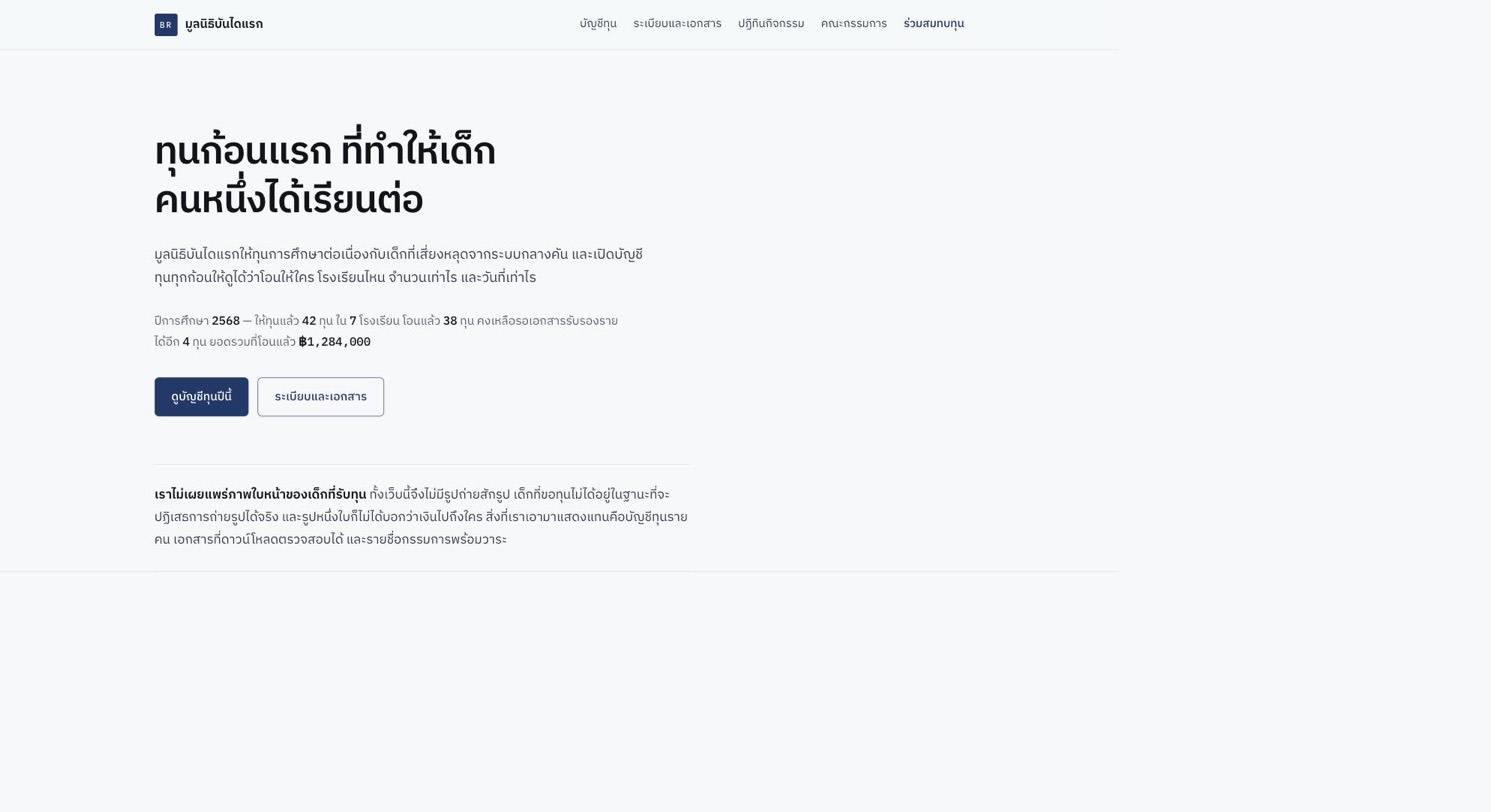
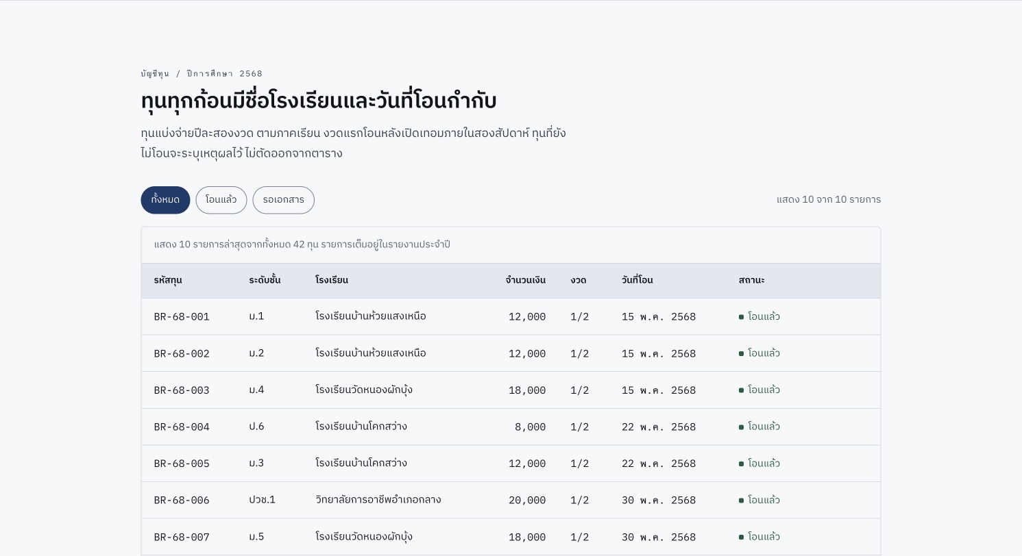
Almost every foundation site opens on a smiling child, an orange donate button and three counting statistics. This one uses none of them. It opens on the ledger instead: a table saying which school each grant went to, how much, on what date, and which grants have not been paid yet and why. Below that sit a document list that states file type, size and revision date before you click, a calendar you can actually page through, and a board directory with terms of office. Amounts, dates and file sizes are set in a monospaced face so the columns line up on their digits — a functional decision rather than a stylistic one.
Nonprofit
UI Design
Light UI
Thai
- A scholarship ledger you can filter by status, with figures in a monospaced face, scrolling inside its own box on a phone rather than moving the page.
- Three months of events in a calendar written from scratch with no library — the first weekday of each month is computed from
Date, never hardcoded.
- A document list that states file type, size and revision date before you click.
- Not one photograph on the entire page, and the page says in words why.
Associations, foundations, clubs, co-operatives and public bodies that keep answering the same three questions — where the money went, where the documents are, and who decides. Organisations with something real to show, which are better served showing it plainly than telling it as a story.
Want something like this?
Adapt this build to your own business
Tell me what your business does, what you want the site to achieve, and roughly what budget you’re working with — I’ll design and build it to fit.
Pricing starts at ฿3,900, depending on scope — see all three packages

 BookEase Dashboard
 BuildNest Construction
 MuseRoom