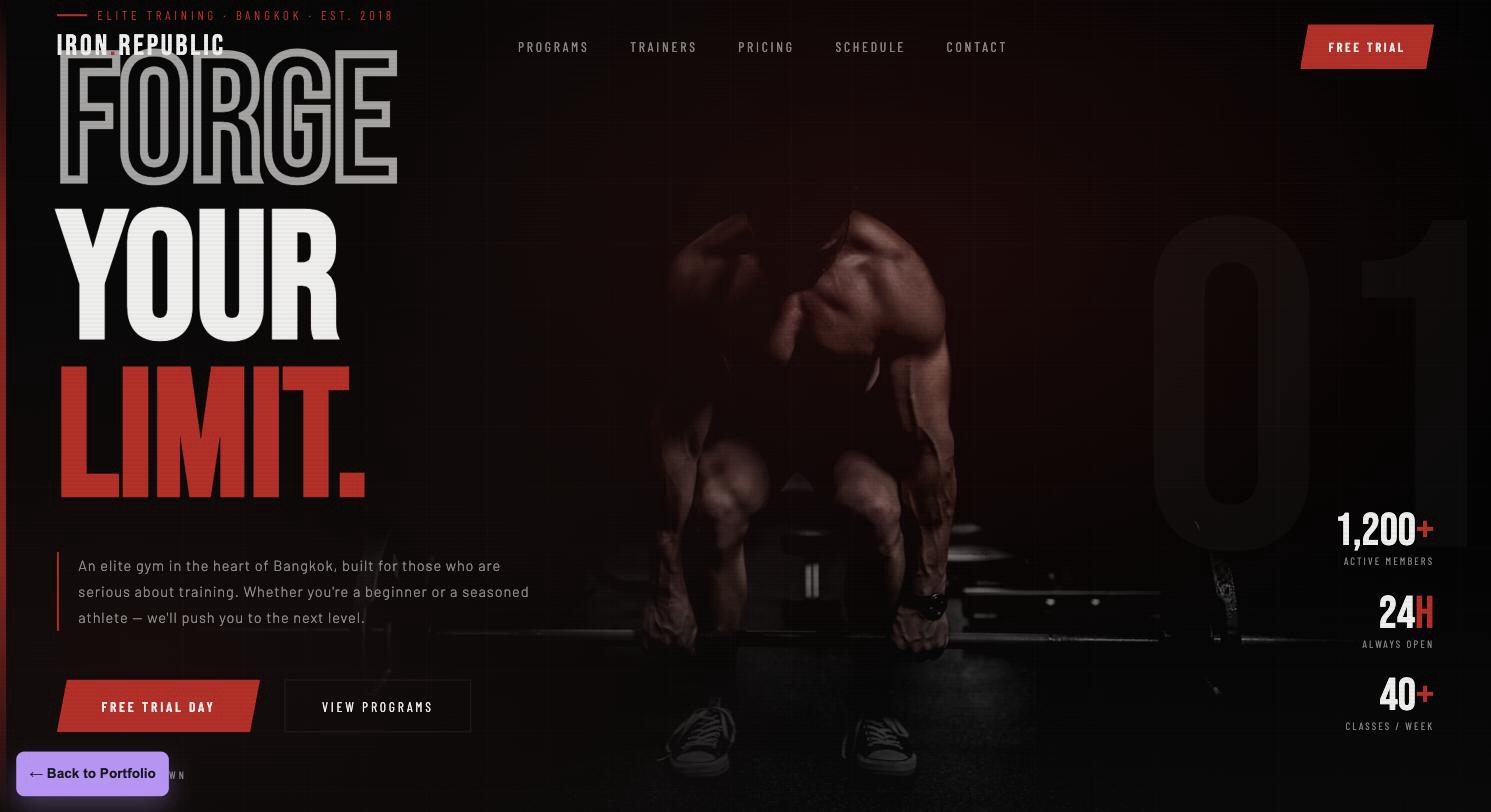
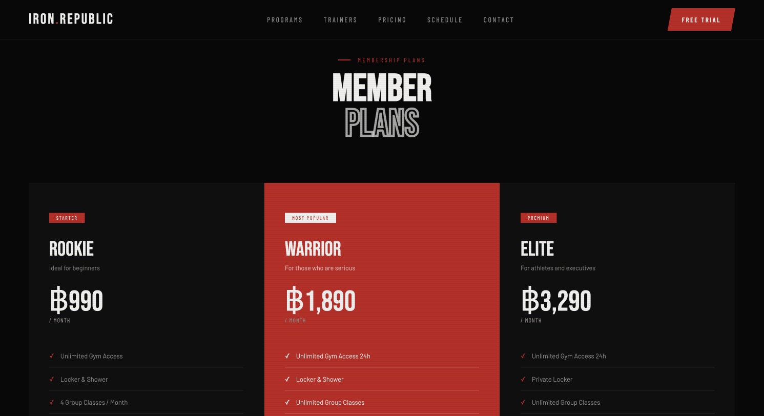
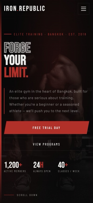
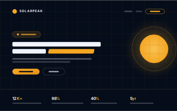
Iron Republic needed a homepage that communicates energy immediately and pushes every visitor toward one clear action — signing up. The page uses a stark black-and-red palette, a bold type-led hero, and a stats strip that sells results instead of amenities.
Fitness brand
Landing page
Conversion
High contrast
- Stark black-and-red palette built for high visual energy
- Type-led hero with a single, unambiguous primary CTA
- Stats strip that leads with results, not amenities
- Mobile-first CTA stacking so sign-up stays one tap away
Built for gyms, combat sports studios, and fitness brands whose whole pitch is energy and results — where a soft, pastel layout would undersell the brand instead of representing it. Use it when one signup is the only action that matters.
Want something like this?
Adapt this build to your own business
Tell me what your business does, what you want the site to achieve, and roughly what budget you’re working with — I’ll design and build it to fit.
Pricing starts at ฿3,900, depending on scope — see all three packages
 BuildNest Construction
 NOIR Coffee
 SolarPeak