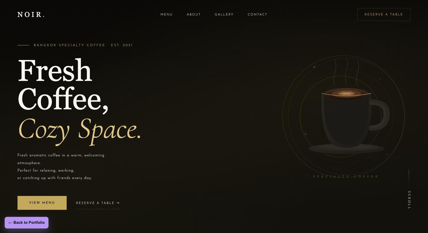
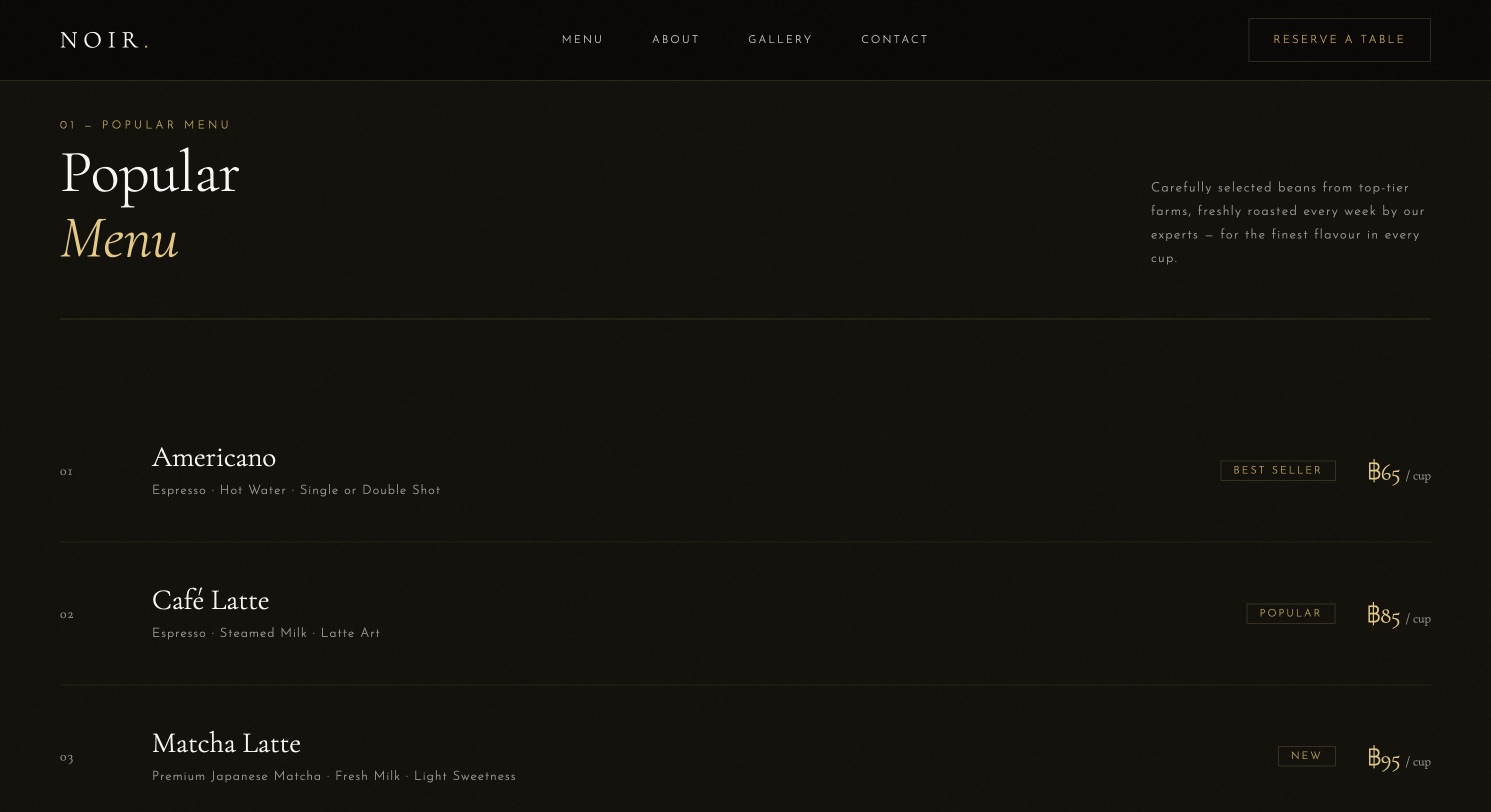
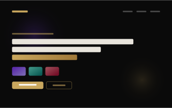
NOIR Coffee wanted a landing page that reads as premium the moment it loads — dark backgrounds, a subtle noise texture, and gold accent lines instead of the bright, generic café template look. The layout leads with an eyebrow and headline stack, then a single confident CTA.
Dark
Coffee
- Dark, textured background instead of a generic bright café template
- Gold accent system used sparingly for a premium feel
- Type-led hero with a restrained, confident CTA
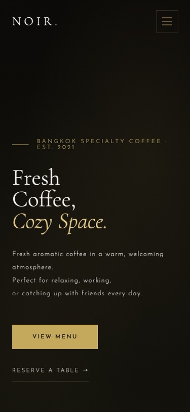
- Layout built to read well on mobile, where most walk-in traffic looks first
This approach suits specialty coffee shops, bars, and other brands where atmosphere is the product — where visitors need to feel the vibe of the space before they decide to visit, not just read a menu.
Want something like this?
Adapt this build to your own business
Tell me what your business does, what you want the site to achieve, and roughly what budget you’re working with — I’ll design and build it to fit.
Pricing starts at ฿3,900, depending on scope — see all three packages
 RATRI Restaurant
 MuseRoom
 Iron Republic